In Search of the Perfect Partial Plot
How I created a custom partial plot function with the help of {edarf}
Introduction
Partial dependence (PD) plots are essential for interpreting Random Forests models. For example, in the case of binary classification, PD plots show the marginal effect of individual predictor variables on the probability of the response.
Several packages in R will generate PD plots for Random Forests, but I’ve never been completely satisfied with any of them, until now.
In this post, I show how I created a customized PD plot function with the help of ggplot2 and the edarf package, thus ending my long search for the perfect Random Forests PD plot in R.
Why I love edarf
My biggest gripe with most PD plot functions in R is how slow they are. In my job, I am usually working with more than 100,000 rows at a time building predictive models. So, not Big Data, but big enough that running computationally intensive functions on my local drive can take a while.
For example, the partialPlot() function in the randomForest package
can take an hour or more to produce PD plots for several predictors when
N > 100,000. In contrast, edarf::partial_dependence() does the same
job in a matter of seconds!
The partial_dependence() function in edarf uses the
marginalPrediction() function from the
mmpf
package to calculate the marginalized effect of a given predictor on the
Random Forests “vote” proportion using Monte Carlo
integration. I
assume that the use of a Monte Carlo method is what makes
edarf::partial_dependence() so fast. But I’m not a mathematician, so
don’t hold me to that.
Just one problem
My only beef with edarf is that I don’t love the plots. Let’s take a
look at an example to show you what I mean.
I am going to train a Random Forests binary classifier using the Sonar dataset from the mlbench package. The dataset contains 60 numeric predictor variables representing different sonar signals bounced off either a metal cylinder or a roughly cylindrical rock. The response variable has two classes: M for metal cylinder or R for rock.
# Load packages and get data
library(tidyverse)
library(mlbench)
library(randomForest)
library(caret)
library(edarf)
library(rlang)

data("Sonar")
df<-Sonar
rm(Sonar)

# Clean up variable names (becuz I'm a bit OCD)
df <- df %>% rename(V01 = V1, V02 = V2, V03 = V3, V04 = V4,
                    V05 = V5, V06 = V6, V07 = V7, V08 = V8,
                    V09 = V9)
I will use the randomForest() function from the
randomForest
package to build the classifier.
# Get minimum class frequency
min <- min(table(df$Class))

set.seed(223)
df_rf <- df %>% na.omit()
fit_rf <- randomForest(data = df_rf,
                       Class ~ .,
                       ntree = 500,
                       importance = TRUE,
                       sampsize = c(min, min))
Notice that I have downsampled the most frequent class, as I have found that this usually gives higher balanced accuracy compared to resampling based on the observed class probabilities.
Let’s take a look at the out-of-bag (OOB) performance using
caret::confusionMatrix().
# Add predicted values to data frame
df_rf <- df_rf %>%
  mutate(predicted = predict(fit_rf))

# Get performance measures
confusionMatrix(df_rf$predicted, df_rf$Class, positive = "R")
## Confusion Matrix and Statistics
##
##           Reference
## Prediction   M   R
##          M 100  17
##          R  11  80
##
##                Accuracy : 0.8654
##                  95% CI : (0.8114, 0.9086)
##     No Information Rate : 0.5337
##     P-Value [Acc > NIR] : <2e-16
##
##                   Kappa : 0.7285
##
##  Mcnemar's Test P-Value : 0.3447
##
##             Sensitivity : 0.8247
##             Specificity : 0.9009
##          Pos Pred Value : 0.8791
##          Neg Pred Value : 0.8547
##              Prevalence : 0.4663
##          Detection Rate : 0.3846
##    Detection Prevalence : 0.4375
##       Balanced Accuracy : 0.8628
##
##        'Positive' Class : R
##
The model has decent predictive performance. So that’s nice.
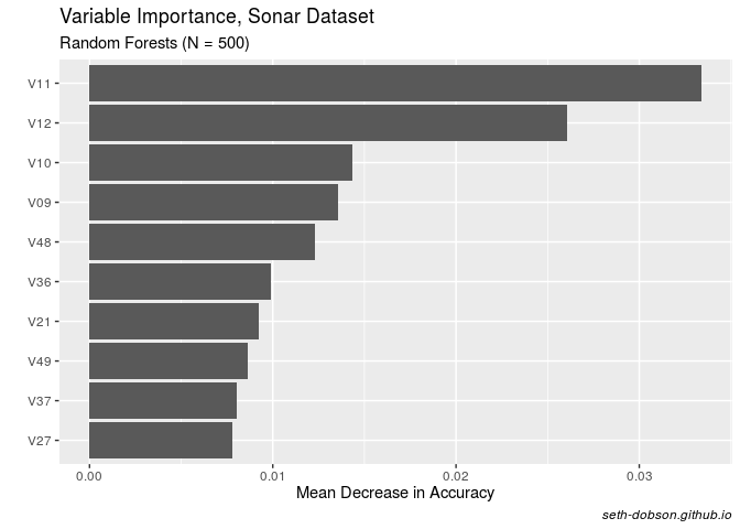
I generally like to make PD plots for just the top predictors in a
Random Forests model. So next let’s get the variable importance of each
predictor using the randomForest::importance() function, and plot the
top 10 based on mean decreased accuracy (note: the values are not scaled
by their standard deviations).
# Get variable importance measures
imp_df <- data.frame(importance(fit_rf, scale = FALSE, type = 1))

# Tidy up and sort the data frame
imp_df <- imp_df %>%
  mutate(names = rownames(imp_df)) %>%
  arrange(desc(MeanDecreaseAccuracy))

# Plot mean decreased accuracy
imp_df %>%
  top_n(10, MeanDecreaseAccuracy) %>%
  ggplot(aes(x = reorder(names, MeanDecreaseAccuracy),y = MeanDecreaseAccuracy)) +
  geom_col() +
  coord_flip() +
  labs(title = "Variable Importance, Sonar Dataset",
       subtitle = "Random Forests (N = 500)",
       x= "",
       y= "Mean Decrease in Accuracy",
       caption = "seth-dobson.github.io") +
  theme(plot.caption = element_text(face = "italic"))

Fig. 1
As you can see in Figure 1, V11 and V12 stand out as being the most important predictors in the model.
Now that we know which predictors are the most important, we can save
the variable names as a character vector and pass it along to
edarf::partial_dependence().
The resulting data frame will contain marginalized probabilities (vote proportions) at each point along a user-specified uniform grid.
# Save top predictor names as character vector
nm <- as.character(imp_df$names)[1:10]

# Get partial dependence values for top predictors
pd_df <- partial_dependence(fit = fit_rf,
                         vars = nm,
                         data = df_rf,
                         n = c(100, 200))
Note that n according to the mmpf documentation is “an integer
vector of length two giving the resolution of the uniform or random grid
on vars for the first element, and the number of the rows of the data to
be sampled without replacement for the second element.”
I chose 100 for the first number because I like to visualize marginal effects over centiles of the predictor variables.
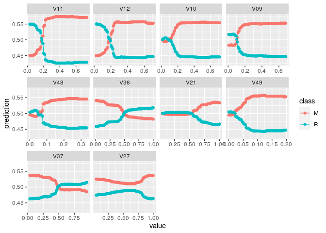
Now we can use the edarf::plot_pd() function to visualize the partial
dependence patterns (Figure 2).
# Plot partial dependence using edarf
plot_pd(pd_df)

Fig. 2
So I have a few issues with this visualization. But first I would like to stress that these are matters of personal preference. I am not arguing that my preferences are more consistent with data visualization best practices.
First, I would rather plot marginal probabilties for one class rather than both. For multinomial prediction problems, I can see how plotting all the classes could be useful. But I’m usually dealing with binary classification problems, and in that case, in my opinion, it’s more useful just to plot the class of interest, i.e., the thing I’m trying to predict.
Second, I would prefer to have the y-axis free rather than fixed. A fixed y-axis can result in very flat looking lines for predictors with a relatively narrow range of probabilities (such as V27). This can make it difficult to quickly visualize whether the predictor has a positive, negative, or more complex relationship with the response. Although a fixed scale is better if you want to get a sense of variable importance from the PD plot. But that’s not usually the main thing I’m looking for in a PD plot. I usually just want to see the shape of the relationship to the response.
Creating my own function
Let’s take a look at the contents of the data frame produced by
edarf::partial_dependence().
glimpse(pd_df)
## Rows: 1,000
## Columns: 12
## $ V11 <dbl> 0.02890000, 0.03602424, 0.04314848, 0.05027273, 0.05739697, 0.064…
## $ V12 <dbl> NA, NA, NA, NA, NA, NA, NA, NA, NA, NA, NA, NA, NA, NA, NA, NA, N…
## $ V10 <dbl> NA, NA, NA, NA, NA, NA, NA, NA, NA, NA, NA, NA, NA, NA, NA, NA, N…
## $ V09 <dbl> NA, NA, NA, NA, NA, NA, NA, NA, NA, NA, NA, NA, NA, NA, NA, NA, N…
## $ V48 <dbl> NA, NA, NA, NA, NA, NA, NA, NA, NA, NA, NA, NA, NA, NA, NA, NA, N…
## $ V36 <dbl> NA, NA, NA, NA, NA, NA, NA, NA, NA, NA, NA, NA, NA, NA, NA, NA, N…
## $ V21 <dbl> NA, NA, NA, NA, NA, NA, NA, NA, NA, NA, NA, NA, NA, NA, NA, NA, N…
## $ V49 <dbl> NA, NA, NA, NA, NA, NA, NA, NA, NA, NA, NA, NA, NA, NA, NA, NA, N…
## $ V37 <dbl> NA, NA, NA, NA, NA, NA, NA, NA, NA, NA, NA, NA, NA, NA, NA, NA, N…
## $ V27 <dbl> NA, NA, NA, NA, NA, NA, NA, NA, NA, NA, NA, NA, NA, NA, NA, NA, N…
## $ M   <dbl> 0.45039, 0.45039, 0.45039, 0.45039, 0.45039, 0.45039, 0.45154, 0.…
## $ R   <dbl> 0.54961, 0.54961, 0.54961, 0.54961, 0.54961, 0.54961, 0.54846, 0.…
As you can see, the data frame does not conform to tidy data principles. The centiles for each predictor are found in separate columns, but the marginal probabilites for each class are in their own columns. It’s a data structure that makes it difficult to work with if you want to take a tidyverse approach to data wrangling and visualization.
To tidy the data frame and create the perfect PD plot, I decided to
write a function. The main
advantage of writing a function is that I can reuse it whenever I build
a Random Forests model. I just need to use source() to bring the
script into the environment.
Here’s the script.
perfectPartialPlot <- function(df, x, y){

  # Save x variable name as string for use in aes_string()
  centile <- "centile"

  # Save marginal probabilities as separate data frame
  vote_prop <- df %>%
    select(y) %>%
    mutate(row = row_number())

  # Gather predictor centiles into a single column and join vote_prop
  pd_tidy <- df %>%
    select(x) %>%
    gather(x, key = "predictor", value = "centile") %>%
    na.omit() %>%
    mutate(row = row_number()) %>%
    left_join(vote_prop, by = "row")

  # Create the perfect partial plot
  ggplot(pd_tidy, aes_string(x = centile, y = y)) +
    geom_line(lwd = 1.25, color = "blue") +
    labs(title = "Partial Dependence",
         x = "",
         y = paste("Proportion of votes for", y)) +
    facet_wrap(~predictor, scale = "free") +
    scale_y_continuous(breaks = scales::pretty_breaks(n = 4)) +
    theme_minimal() +
    theme(plot.title = element_text(hjust = 0.5))

}
Two important things to note about the code in this function.
- I have to use
ggplot2::aes_string()instead of the usualaes()because the input to the function referring to y is a string (see below). Soaes()will not work. - Also, because
tidyr::gather()produces a new variable name that is not a string, it is necessary to save the variable name as a string in the function so I can useaes_string(). That’s whatcentile <- "centile"is doing. Not ideal, but it works.
To use the perfectPartialPlot() function, we need three inputs: (1) a
data frame output from edarf::partial_dependence(), (2) a character
vector of predictor names, and (3) the class of interest.
Let’s run it!
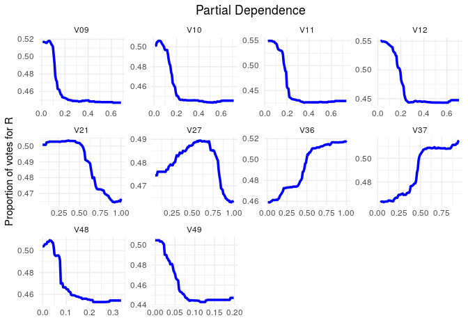
perfectPartialPlot(df = pd_df, x = nm, y = "R")

Fig. 3
Out comes the perfect PD plot, or at least one that I like better than
the default option in edarf.
Conclusion
In this post, I showed how I wrote a custom function to create a partial
dependence plot for the top predictors in a Random Forests model, based
on the super fast edarf::partial_dependence() function.
For me, this illustrates the power of R: total control and flexibility. Don’t like the default plots of your favorite stats package? Well, if you use SAS or SPSS, you’re stuck. However, in R you can always write your own function to produce a plot exactly the way you want it.
UPDATE (2019-08-12)
Sergio Oller helped me out with this on
Twitter. He pointed out that rlang::sym() converts strings to symbols,
i.e., removes those pesky quotes. So instead of using aes_string() and
having to assign "centile" to an object inside the function, I can use
aes() and convert the argument y to a symbol directly using
aes(x = centile, y = !!sym(y)).
Here’s what the new function looks like. Same result as above, but using more efficient code.
perfectPartialPlot <- function(df, x, y){

  # Save marginal probabilities as separate data frame
  vote_prop <- df %>%
    select(y) %>%
    mutate(row = row_number())

  # Gather predictor centiles into a single column and join vote_prop
  pd_tidy <- df %>%
    select(x) %>%
    gather(x, key = "predictor", value = "centile") %>%
    na.omit() %>%
    mutate(row = row_number()) %>%
    left_join(vote_prop, by = "row")

  # Create the perfect partial plot
  ggplot(pd_tidy, aes(x = centile, y = !!sym(y))) +
    geom_line(lwd = 1.25) +
    labs(title = "Partial Dependence",
         x = "",
         y = paste("Proportion of votes for", y)) +
    facet_wrap(~predictor, scale = "free") +
    scale_y_continuous(breaks = scales::pretty_breaks(n = 4)) +
    theme(plot.title = element_text(hjust = 0.5))

}
Questions or comments?
Feel free to reach out to me at any of the social links below.
For more R content, please visit R-bloggers and RWeekly.org.