Charting the CMV Awareness Gap
Sometimes it’s okay to use a secondary axis
Introduction
Speaking of viruses, did you know that June is National Cytomegalovirus (CMV) Awareness Month? Probably not, since most people have never heard of CMV (hence the need for a national awareness month).
CMV is a common virus that infects 50-80% of people by the time they are 40 years old. In most cases, it’s not a big deal. But if a pregnant woman becomes infected, she can pass the virus to the unborn child, which results in a congenital infection about 33% of the time.
Congenital CMV (cCMV) is the number one viral cause of birth defects in children. According to National CMV Foundation, 1 in 200 children are born with CMV every year. That’s roughly 30,000 children. About 1 in 5 children born with CMV infection will have moderate to severe health problems including:
- Hearing loss
- Vision loss
- Feeding issues
- Intellectual disability
- Microcephaly (small head or brain)
- Cerebral Palsy
- Seizures
Outcomes associated with congenital CMV are wide-ranging and unpredictable.
Despite how common and potentially damaging CMV is, research shows that only 9% of women have heard of the condition.
Awareness = prevention
Our son Gideon was born with congenital CMV in 2013. Like most parents, we had never heard of cCMV until our son was diagnosed.
Because cCMV is a viral infection, it is potentially preventable during pregnancy if you know to take certain basic precautions. However, knowing to take precations requires having heard of the condition in the first place, which brings us back to the need for a National CMV Awareness Month.
One of the main tactics used in CMV awareness raising efforts is to highlight the “awareness gap” between how few women have heard of CMV and how many children are disabled by the condition each year.
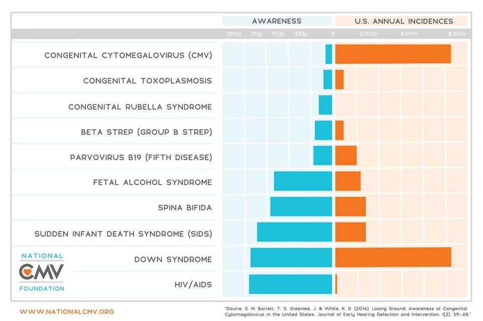
In the past, the National CMV Foundation has used the graphic below for this purpose (Fig. 1). It nicely shows levels of awareness vs incidence of various congenital conditions in the US, based on data from Doutre et al. (2016).

Fig. 1
Recently, I was asked by the Foundation to revise this graphic to enhance its effectiveness (not coincidentally, my wife is the Chair of the Scientific Advisory Committee).
In this post, I describe my approach using ggplot2, as well as cowplot and related pacakges in R.
Mind the gap
Technically speaking, Fig. 1 is what you would call a bi-directional, mirrored, diverging, or back-to-back bar chart. It is reminiscent of pyramid style bar charts often used to visualize population age distributions.
I suspect that when people see Fig. 1 they have a perceptual tendency to sum the bars together rather than take the difference between each bar. The former is typically how a bi-directional bar chart would be interpreted. But since the purpose of the visualization is to highlight the CMV awareness gap, it might be better to actually plot the gap (linear distance) between awareness and incidence of long-term health problems for cCMV in comparison to other conditions.
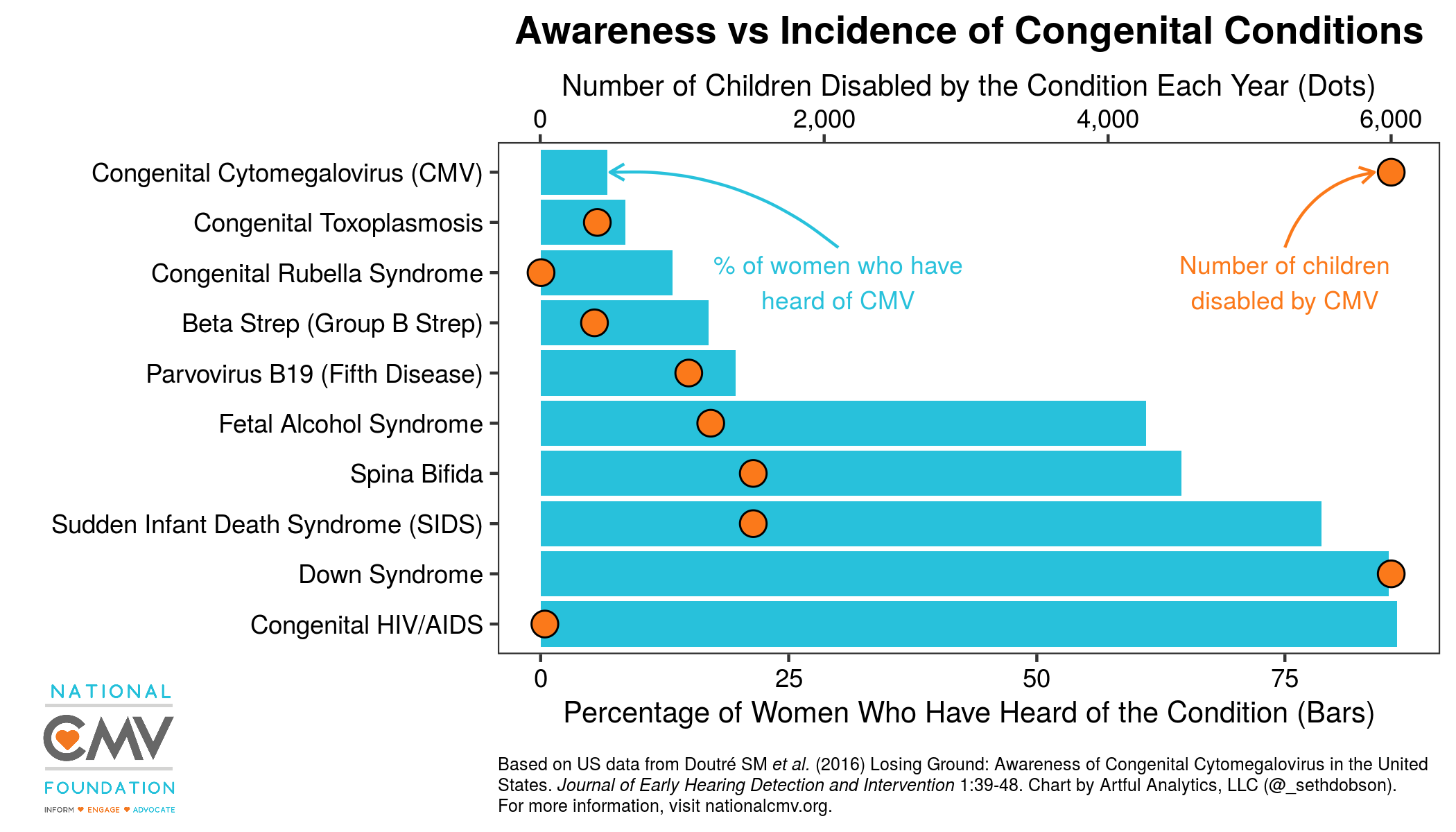
So my proposed enhancement is to layer the incidence data as a series of dots on top of an ordered bar chart representing increasing awareness on the x-axis, and use a secondary x-axis for incidence. Layering in this way will create a visually salient gap between awareness and incidence for cCMV at the top of the chart, which I can further highlight with some text annotations.
Secondary axis (of evil?)
Early versions of {ggplot2} did not include the ability to add a secondary axis because Hadley Wickham believed (and probably still believes) that using a separate, secondary axis is a fundamentally flawed approach.
However, more recent versions of the package have included this
functionality with the sec_axis() function described
here. I think
we can assume from the addition of this functionality that Hadley isn’t
completely averse to the use of a secondary axis in some situations when
used with caution.
Again, my rationale for using a secondary x-axis in this case is to achieve a specific perceptual effect, to higlight the gap between cCMV awareness and incidence of disability visually so that people viewing the chart will say “Wow! That’s some big gap.” And I think I can achieve this without being manipulative or misleading, becuase the gap really is quite big.
Without further ado…
Here’s how the chart looks (Fig. 2). You can download a high resolution version here.

Fig. 2
And here’s the R code that produces the chart.
library(tidyverse)
library(cowplot)
library(ggtext)
library(magick)

# Get data from Doutre et al.

df <- tribble(
  ~condition, ~awareness, ~incidence,
  "Congenital Cytomegalovirus (CMV)", 6.7, 6000,
  "Congenital Toxoplasmosis", 8.53, 400,
  "Congenital Rubella Syndrome", 13.27, 3,
  "Beta Strep (Group B Strep)", 16.91, 380,
  "Parvovirus B19 (Fifth Disease)", 19.63, 1045,
  "Fetal Alcohol Syndrome", 61.04, 1200,
  "Spina Bifida", 64.54, 1500,
  "Sudden Infant Death Syndrome (SIDS)", 78.7, 1500,
  "Down Syndrome", 85.44, 6000,
  "Congenital HIV/AIDS", 86.33, 30
)

# Get National CMV logo

logo <- image_read("https://github.com/seth-dobson/cmv-charts/blob/master/CMV-Full-Tagline-Logo_Transparent.png?raw=true")

# Create chart

p <- df %>%
  ggplot(aes(x = reorder(condition, desc(awareness)), y = awareness)) +
  geom_col(fill = "#28C1DB") +
  geom_point(
    aes(x = condition, y = incidence / 70),
    size = 4,
    pch = 21,
    fill = "#FB791A"
  ) +
  scale_y_continuous(
    sec.axis = sec_axis(
      ~ . * 70,
      name = "Number of Children Born with the Condition Each Year (Dots)",
      labels = scales::comma_format()
    )
  ) +
  coord_flip() +
  labs(
    x = "",
    y = "Percentage of Women Who Have Heard of the Condition (Bars)",
    title = "Awareness vs Incidence of Congenital Conditions",
    caption = "Based on US data from Doutré SM *et al.* (2016) Losing Ground: Awareness of Congenital Cytomegalovirus
    in the United States. *Journal of Early Hearing Detection and Intervention* 1:39-48. Chart by Artful Analytics,
    LLC (@_sethdobson). <br>For more information, visit nationalcmv.org."
  ) +
  theme_bw() +
  theme(
    plot.title = element_text(face = "bold", hjust = .5),
    plot.caption = element_textbox_simple(size = 6, margin = margin(10, 0, 0, 0)),
    axis.text = element_text(color = "black"),
    axis.title = element_text(size = 10)
  ) +
  background_grid(major = "none") +
  annotate(
    geom = "text",
    label = "Number of children\nborn with CMV",
    x = 7.8,
    y = 75,
    color = "#FB791A",
    size = 3
  ) +
  annotate(
    geom = "curve",
    x = 8.5,
    y = 75,
    xend = 10,
    yend = 84,
    curvature = -.3,
    arrow = arrow(length = unit(2, "mm")),
    color = "#FB791A"
  ) +
  annotate(
    geom = "text",
    label = "% of women who have\nheard of CMV",
    x = 7.8,
    y = 30,
    color = "#28C1DB",
    size = 3
  ) +
  annotate(
    geom = "curve",
    x = 8.5,
    y = 30,
    xend = 10,
    yend = 7,
    curvature = .20,
    arrow = arrow(length = unit(2, "mm")),
    color = "#28C1DB"
  )

# Combine chart with logo

ggdraw() +
  draw_plot(p) +
  draw_image(
    logo,
    x = .075,
    y = .1,
    scale = .2,
    hjust = .5,
    vjust = .5
  )
A few things to note about the code above:
- The secondary x-axis is actually coded as a secondary y-axis since
you have to use
coord_flip()to get the categorical variable on the y-axis when usinggeom_col(). - The
sec_axis()function is used in conjuction with thesec.axisoption withinscale_y_continuous(). In order to align the two y-axes, I multiplied the secondary axis by 70 withinsec_axis()and divided incidence by 70 within the aesthetics ofgeom_point(). I arrived at the number 70 by trial and error. Not sure why this works, but it does. - I used the ColorZilla Google Chrome extension to get hex color values from the National CMV logo. That way I was able to match the colors in the logo to the chart elements without a lot of guesswork.
- I am using the amazing
ggtext package by Claus Wilke to render the
plot.captiontheme element in markdown, so I can easily italicize selected words with asterisks. Theelement_textbox_simple()function from {ggtext} also does word wrapping automatically.
Conclusion
Hopefully you will agree that my combination bar and dot chart (Fig. 2) is an improvement on the original graph (Fig. 1) in that it highlights the CMV awareness gap more effectively for a general audience. I also trust that Hadley would agree that this is an acceptable use of a secondary axis. Altough, he might not. So nobody tell him, OK?
To learn more about congenital CMV visit nationalcmv.org.
Questions or comments?
Feel free to reach out to me at any of the social links below.
For more R content, please visit R-bloggers and RWeekly.org.